With a goodly part of China’s shopping malls under construction at any given moment, screening erected to protect shoppers’ delicate eyes from ugly building work has become a way to show potential customers the goodies that lie in store.

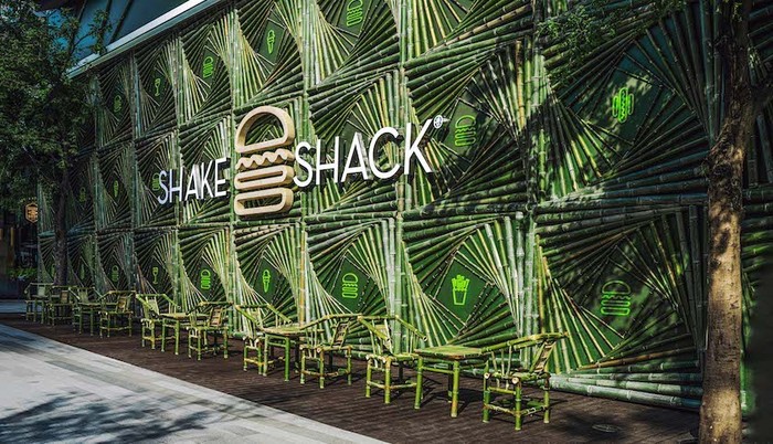
The construction fence of Shake Shack in Chengdu, Sichuan Province.
By LU Yibei
The first time a fence was used as a billboard was way back in 1867. Now, this traditional form of spontaneous publicity has become an opportunity for brands to connect with customers before their stores are even built.
Shake Shack, which will open this summer in Taikoo Li Chengdu, is now surrounded by a bamboo-covered facade, an “art” installation called “Chengdu Bamboo Castle” inspired by Sichuan Province’s bamboo groves. Made from 58 tons of bamboo in 2760 pieces, the structure took three weeks to complete.
The Shake Shack fence will vanish once the store opens, but for now, devoting so much manpower, materials and money to it has already proved more than worthwhile. It is already a heavily tagged photo magnet on social media.

When people post photos, brands get exposure – free exposure. On Xiaohongshu, or Little Red Book, China's Instagram equivalent, there are already over 10,000 tagged posts. Not bad publicity for a restaurant that is yet to serve a meal.
“Fence banners are a very powerful form of publicity,” said CHEN Bin, director of designers Coin Company. “It is directly exposed to a large target group of customers who already frequent the locale. It is much more effective than any other kind of ad.”
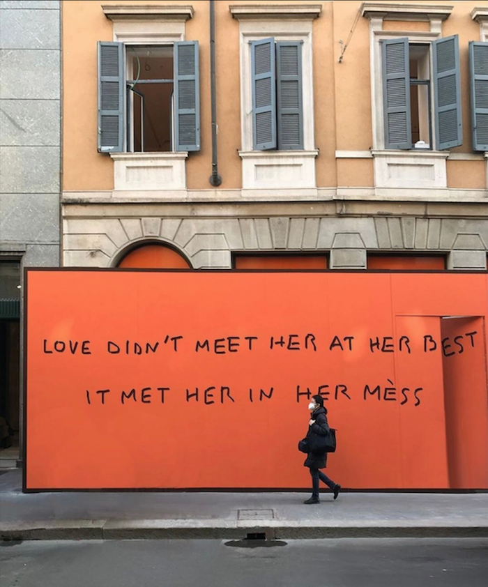
Big brands tend to design hoardings by exploiting whatever is most recognizable about themselves - colors, graphics, logos, catchphrases. Last year, Hermes kicked up a social media storm with a sign featuring nothing but a background in Hermes’ signature orange and a phrase containing a questionable pun: “Love didn’t meet her at her best, it met her in her mess.”

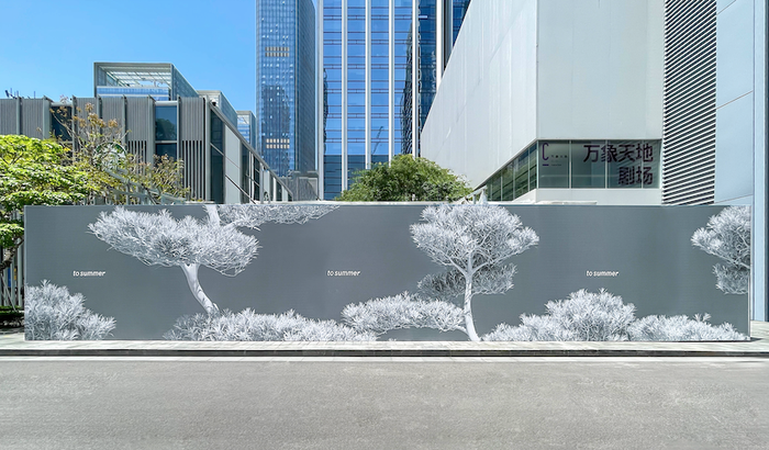
Trending brands focus on their corporate narrative and aesthetics to show their creativity and originality. Fragrance To Summer adopted the theme of a traditional courtyard in billboards enclosing the construction site of its first store in Shenzhen, Guangdong Province. A barrier adorned with white branches and leaves conceals some real trees lurking behind.

Start-up brands want consumers to get a handle on them quickly, so they usually provide direct information. Most catering businesses simply show their food.
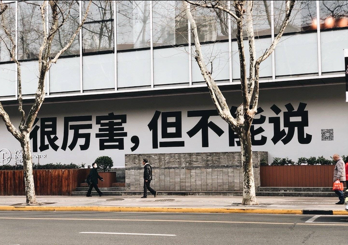
Others seek to exploit whatever intrigue they can to set tongues wagging. In Shanghai, TX Huaihai piqued people’s curiosity with the phrase, “It’s good, but I can’t tell you how.” Many fell for the trick, taking to their social media accounts to ask, “Just how good was it?”

Shopping malls that consider themselves arty or chic are keen on quirky displays. K11 usually turns vacant shops into art spaces or sets up experiential installations for customers. “In many cases, brands don’t put their products directly in such valuable advertising space. Everyone is playing with creativity, imagination and art,” Chen Bin said. But there are difficulties in design.
Temporary, constantly changing and always new, fancy fences bring color and character to what were once forgettable heaps of dusty building materials. Most brands lose their nerve at some stage and opt to cram their space with more information than anyone could possibly want or need.
In theory at least, content crossover leaves customers unable to identify with clever themes, so recognition is reduced. Designers have to consider the audience, capabilities of the construction team, purpose, site and situation. And to come in under budget.